Mobile first design: Why is it so important and what are its advantages?

What is mobile first design?
Mobile first design is an approach to website and application design that prioritizes the mobile user experience over the desktop experience. It involves designing for the smallest screen size first, such as a mobile phone, and then expanding the design to larger screen sizes, such as tablets and desktops. The goal of mobile first design is to ensure that a website or application is optimized for the mobile experience, which is becoming increasingly important as more users access the internet through mobile devices. By designing with a mobile first approach, designers can create a more streamlined, efficient, and user-friendly experience for mobile users.

Advantages
Using a mobile first design approach allows you to think about what really needs to be on your website. Instead of trying to fill in all the blanks, you focus on what the user actually wants. To maintain optimal functionality, you will work harder to ensure that your website contains only the most important content and features necessary for the success of your business.
Faster page loading times: Mobile devices generally have slower internet speeds and less processing power, so designing for mobile first often results in faster loading times for all devices.
Better scalability: Designing for mobile first means that the layout and content must be prioritized, resulting in a more scalable design that can easily adapt to larger screens.
Improved SEO: Mobile-first design can improve search engine optimization (SEO) by ensuring that your website or application is optimized for mobile devices, which is increasingly important as more users access the web through mobile devices.
“Designing for mobile should no longer be seen as an option; it should be seen as a requirement.”
– Luke Wroblewski, Product Director at Google.
Better user experience
Mobile first design focuses on helping users navigate through a website or app easily and efficiently. Because it’s designed as a complete experience, it’s more likely to offer a better user experience than conventional, responsive web design.
A positive product experience on all devices is sure to result in a constant increase in conversions and customer retention. And this, as is known, is the main concern of every company. If a website is not optimized for mobile devices, there is a high risk that users will visit it less often, even if they like the product or content.
Clearer content hierarchy: By prioritizing content for smaller screens, mobile first design often results in a clearer and more organized content hierarchy that is easier for users to navigate and understand.
More intuitive navigation: With limited screen space, mobile-first design often requires more thought and creativity when it comes to navigation, resulting in more intuitive and user-friendly navigation systems.
More engaging design: Mobile first design often requires designers to be more creative with limited space, resulting in more engaging and visually interesting designs that can capture users’ attention.
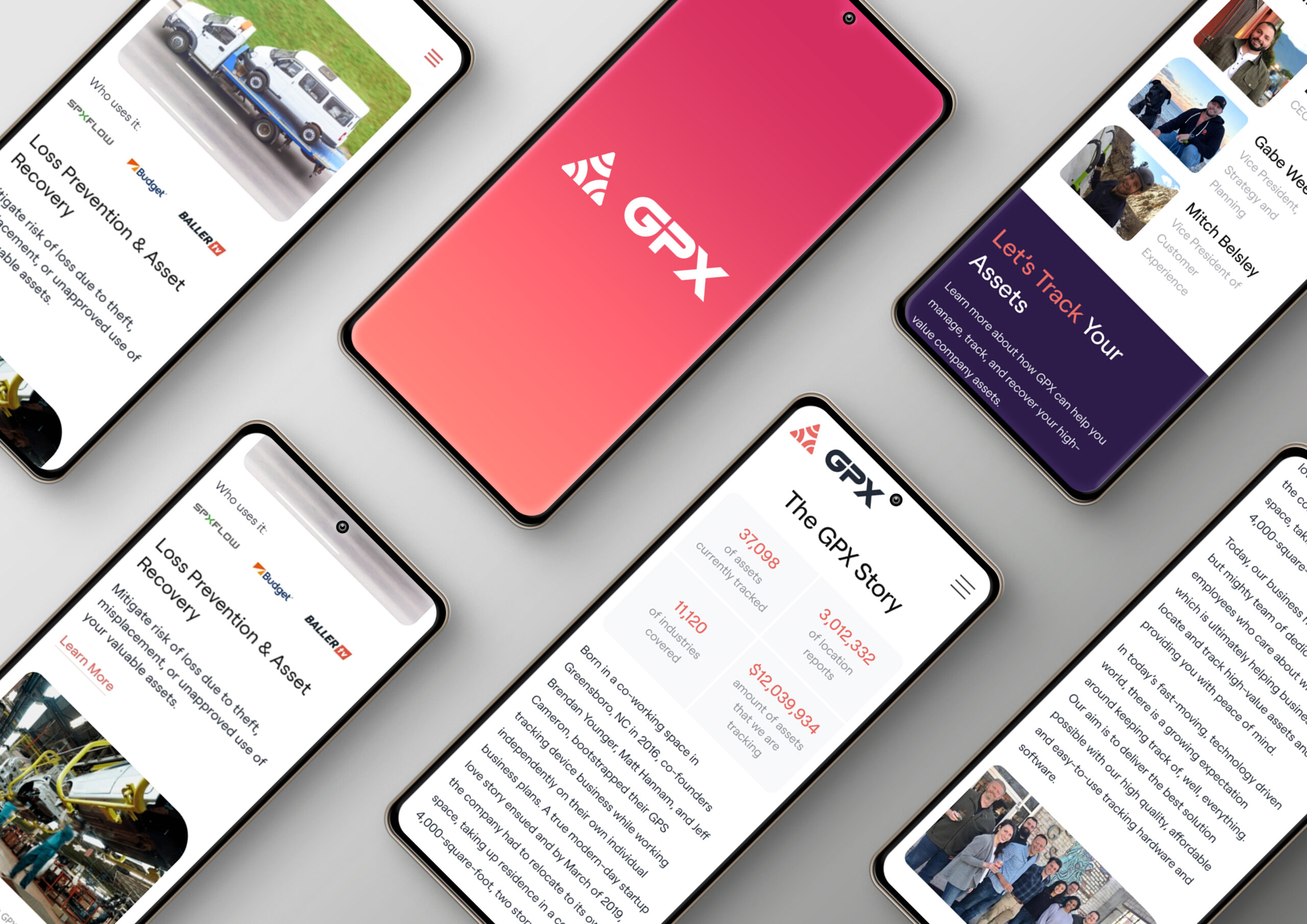
– Mobile-first web design for GPX. Design: Mayven Studios
Likeability
The number one rule of marketing is to know your audience so you can meet them where they are. Since mobile users now make up the majority of Internet traffic, it is reasonable to start designing using mobile screen dimensions, reflecting and optimizing site content based on consumer habits.
Improved user satisfaction: By focusing on the user experience on mobile devices, mobile-first design can result in improved user satisfaction and a more positive perception of your brand or application.
Better engagement: A well-designed mobile-first application or website can encourage more frequent use and engagement with users, leading to increased brand loyalty and advocacy.
Increased conversions: By optimizing for mobile devices, mobile-first design can also increase conversions, such as purchases or sign-ups, by making it easier and more convenient for users to complete desired actions.
SEO
Back in almost 5 years, Google made page load speed a ranking factor for mobile searches. This has led companies all over the world to improve the speed of their pages. Mobile first design can have a positive impact on search engine optimization (SEO). Here are some reasons why:
- Improved User Experience: Google prioritizes websites and applications that provide a good user experience. By designing with a mobile first approach, you can create a more user-friendly experience for mobile users, which can improve user engagement, reduce bounce rates, and improve user retention. All these factors are important ranking signals for search engines.
- Faster Page Speed: Mobile-first design usually involves optimizing images, using lightweight code, and reducing page weight. This can lead to faster loading times on mobile devices, which is also a critical ranking factor for search engines.
- Responsive Design: A mobile first design often employs a responsive design, which means the website or application can adapt to different screen sizes and devices. This approach ensures that your website is accessible to a broader range of users, including mobile users, which can help improve your search engine rankings.
- Increased Mobile Usage: With more people using mobile devices to access the internet, Google has prioritized mobile-first indexing. This means that Google now uses the mobile version of a website to determine its relevance and rank it in search results. By designing with a mobile-first approach, you are ensuring that your website is optimized for mobile devices and meets Google’s standards for mobile-first indexing.
How much mobile first design is needed?
Overall, designing with a mobile first approach can help improve your website’s ranking in search engine results and provide a better user experience for your visitors.
Mobile first design is becoming increasingly important as more and more users are accessing the internet through mobile devices. In fact, mobile internet usage has surpassed desktop usage, so designing with mobile in mind is no longer optional but essential.
While the degree of mobile first design necessary will depend on your specific business and target audience, it is recommended to adopt a mobile-first mindset for designing websites and applications. Designing for mobile devices first ensures that the website or application is optimized for the smallest screen size and provides a good user experience on mobile devices. Mobile first design involves more than just designing for small screens. It also requires a focus on mobile-specific needs, such as touch-friendly buttons and menus, simplified navigation, fast loading times, and easy access to essential information.
However, mobile first design doesn’t mean that desktop users are ignored. Rather, it means designing with mobile in mind first and then scaling up the design to larger screens. This approach can ensure that your website or application provides a consistent user experience across all devices and screen sizes.
In summary, designing with a mobile first approach is critical for providing a good user experience, improving search engine optimization, and meeting the needs of mobile users. The degree of mobile first design necessary will depend on your specific business and target audience, but it’s essential to adopt a mobile-first mindset for designing websites and applications.