15+ Examples of Design Agency & Brand Style Guides

Have you ever considered developing a properly documented style guide to build your brand identity?
Often times this question receive a negative answer. And don’t feel bad if you don’t fully understand the concept of brand style guides. Because most don’t. It’s the main reason why this subject is often overlooked by the majority of small businesses.
But, if you care about how your brand is perceived by consumers, you should pay close attention to developing a brand identity for your company. And, of course, you can’t build a brand identity without a style guide.
A style guide, or a style manual, is mainly a set of standards and rules that you set to define your company. It’s the style of writing you use to describe your company, the colors you use in brand elements, typography, graphics, etc.
Why take the time to create a style guide? Well, imagine that you’re hiring a marketing agency to handle your social media channels and blogs. Wouldn’t it be nice for you to have a set of rules that you can share with these companies to maintain your brand identity and consistency?
Most small businesses don’t believe that a style guide is necessary, but all successful brands in the world have one. Here’s proof.
Apple
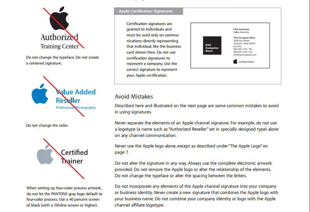
No one takes design more seriously than Apple, the company that revolutionized the personal computer and smartphones. The brand went through several changes over the years, but they always kept their identity intact. The company even has a special identity guideline made just for its channel affiliates.

Google completely transformed all of its websites, apps, and its operating systems after introducing its brand new Material Design guidelines. Then it quickly became one of the most popular trends in the web design industry. Even though it’s not technically a brand style guide, it just goes to show how far a brand would go to establish its brand identity.

Adobe
Since the very beginning of the company, Adobe has had a style guide that reflects its corporate mission and positioning, as well as its brand platform. Everything from Adobe’s logo to color guides, imagery, and typography guides are included in its style guide.

BPR
RedStone, the marketing and branding agency, has created this branding toolkit for BPR’s The Big Lottery Fund to help them “communicate better among themselves”. Instead of putting the style guide in a document, RedStone has designed it as a poster so that the company could easily use and showcase its style guide.

British Rail
Style guide is not a buzzword that came to exist in 2016, It’s been in use for years. The British Rail Corporation has been maintaining its brand identity perfectly since 1965, thanks to its well organized and highly detailed style guide.

MailChimp
MailChimp, the popular email marketing software provider, takes its brand identity very seriously, especially when it comes to content creation. The brand’s content style guide for its employees covers a wide range of topics, including the use of grammar, writing blogs, writing for social media, web elements, and much more.

Style guides aren’t limited to big corporate brands and businesses, it can be used to design great apps too. WhatsApp follows a specific style guide to better improve the company. Because for them “it’s a set of values, attributes, and artwork that reflects the spirit of their company.”

Red Cross
The single-sheet brand style guide of the American Red Cross nicely packs all the necessary details of maintaining a brand identity. And it also keeps things simple to make it easier for everyone to understand.
Habitat
How does a retailer that sells household items keep consistency among thousands of products and items? The answer is in its massive style guide. Habitat’s style guide seems to cover everything from its brand logo to small mugs they sell in stores.

With Microsoft’s recent acquisition of LinkedIn, we might see some changes for the professional social network in the near future. But, up until now, the brand kept a tight style guide that eventually made them a $26 Billion company.

Skype
Instead of using strong technical language in its style guides, Skype takes a much more attractive approach that makes it fun to get to know their company. Skype’s style guide is filled with both humor and information.

Amazon
Amazon is a multi-billion dollar company. You can imagine just by looking at its brand usage guidelines manual how many other style guides the company may have for the different sectors in the company.

Twitter knows about the importance of brand identity and it has gone to quite lengths to make sure that not only the company but also the press and the media follows its brand style guide to the letter. Which is why the company has made its style guide publicly available.

Bing
Even though it’s not as big as Google or Yahoo, Microsoft seems to have paid close attention when building its Bing search engine to meet the highest quality standards. Bing’s product guidelines manual is proof of that.
Chempoint
The chemical sales and distribution company, Chempoint follows a simple and a minimalist brand style guide that also keeps its sophisticated brand identity.
Hornall Anderson, the designer behind Chempoint’s brand identity has decided to choose a minimalist design for the company to make the brand stand out in “a space where competitors look alike and sound the same.”

University Of Dayton
Does a university need a brand style guide? The University of Dayton seems to think so. Their brand style guide covers all the necessary rules of brand identity to be used when promoting and representing the university.

Child Of Light
That’s right! Even video games require style guides for keeping consistency throughout the game. Daniel Gagne was the only UI artist working with Ubisoft Montreal to develop this game. For a one man army, he seems to have done a great job compiling this Art Direction Style Guide for the game.

A brand style guide may seem like an unnecessary waste of time when you’re first starting out your design agency, but it will come in handy in the long run when you’re branching out, designing billboards, signage, and brochures. It’s like what they say, “If you’re going to do something, then do it right.”


