Every brand, from the smallest website or startup, to corporate giants such as Nike or McDonald’s, need a set of branding guidelines and rules to maintain their identity. This document, which can range from a couple of pages, to several hundred, is the thread that holds together what the public sees from a company.
A brand bible establishes the voice and personality of a company, as well as who the public will see, and it governs every aspect of communication from the company. The brand bible is the basis for all interactions on behalf of a company – personal communications, social media, advertising and design. While a brand bible focuses on many things, we are really going to look at how it affects design.
What Is a Brand Bible?
A brand bible or book is a document that establishes distinct guidelines on how all aspects of a company’s brand will be handled. It should establish rules for creating a unified and identifiable presence for your brand. This includes everything from the design of a logo and how it can be used, to letterhead, the look of a website, personal communications and how it all looks.
The brand bible is meant to help employees properly use and communicate the message of a brand. It outlines brand goals and the company philosophy. Further it answers a few key questions: What is the correct spelling and use of the brand (and afflicted) names? What images are associated with the brand and product lines? In what ways can/should the company logo be used? What are people allowed to say about the brand? What marketing tactics are preferred or encouraged versus what marketing tactics should not be used?
It also serves as a guide for designers. A good brand bible outlines all of the basic design tools that are needed to create and disseminate company communications – from allowable typefaces and styles, to a color palette, to image use, text and tone, and the emotion portrayed by the brand.
Logo Usage
Once you have the perfect logo, it is important to maintain the integrity of it across platforms. This includes how the logo is to be used, from placement to acceptable alterations.
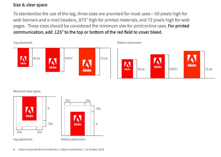
Adobe’s 2010 Brand Guidelines do a great job of defining exactly how the logo can be used, outlining placement, size and surrounding white space. Remember, your logo is the simplest thing people have to identify your brand, make sure you maintain a consistent use of that image.
Fonts and Typography
There should be a defined style for every bit of type used for a brand, for both print and digital applications. Rules for how to use typography should be clear and distinct, from what typefaces are acceptable, how each is used, and guidelines for additional styling, size and use of color.
Select a few typefaces that will be used in design projects. This may include one set of rules for print projects and another for digital applications. But make sure the typefaces have some common links. For example, many web designers prefer sans serif typefaces for body text whereas you may prefer a serif style for print. Find a commonality between the two. Consider a headline or “big type” style that you can use for both types of design projects.
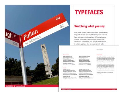
Most brands use one of two primary typefaces. The example above from the North Carolina State University Brand Book uses the Univers family, both regular and condensed styles. Then select a complimentary typeface and substitute typefaces. Ideally, the brand should include no more than five typefaces and their usage.
Colors
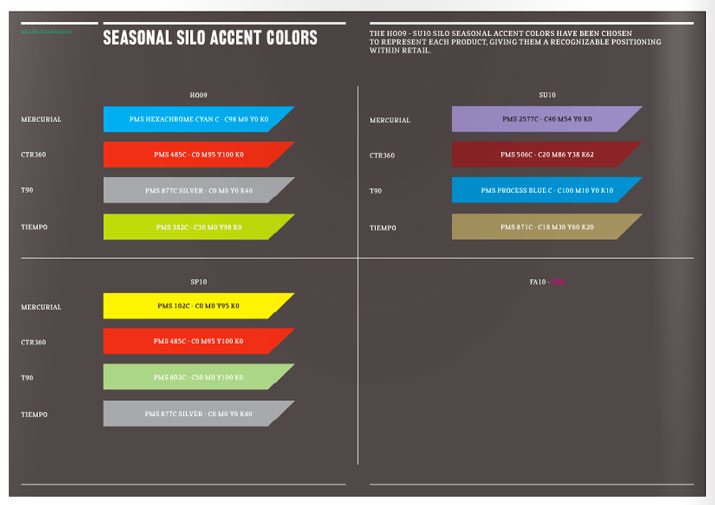
A defined color palette can be one of the most important aspects of the brand bible. Consider the Golden Arches and color the represent McDonald’s, for example. Would you as clearly recognize this company if the giant M was another color?
The brand bible should outline each color and how it should be used. This includes colors that appear only in a logo to colors that are used for backgrounds, text and other design elements. The numbers of colors in a palette should be kept to a minimum and can include fully saturated versions and tints.
Further the document should clearly define each color by name and color value for a variety of projects. Choose primary, secondary and alternate colors for the palette. Define each color with values for print (CMYK) and digital projects (RGB, HEX). Also note Pantone colors as such with their assigned values.
Images
Guidelines for images are about more than just whether you will rely on photography or illustrations or other types of graphics. The brand bible should detail how images will be gathered, edited and used.
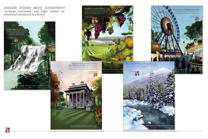
Nike, for example, relies on large, tight, high-contrast images to draw you in. The I Love NY campaign above uses location-based images from photos that are restyled as drawings to capture attention and create a feel.
Image guidelines should also define when and how certain types of images are used. Will you use photography or illustrations or both? Is clip art use acceptable? How will images be edited? Will they be black and white or color? All of these questions should be answered in your image guidelines.
Text and Tone
Finally, you want to make sure the things you say fall in line with the brand image. This applies to everything from the headlines in an ad, to the tone of a press release, to the way blog posts are structured.
Outline the type of acceptable language that will be used. Is the context wordy, or simple and compact? Should the tone be formal, or more conversational? Who is the audience you plan to target? Write for them.
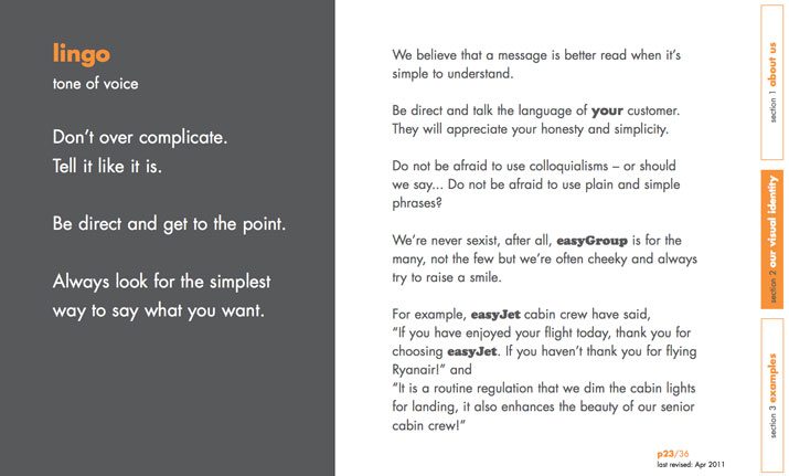
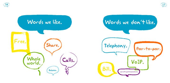
Easy.com defined its brand lingo in simple terms and used a style that mirrors the tone of actual communications. For the brand, simplicity is the key. Skype follows a similar philosophy, going as far to showcase words the company likes and does not like.
Using a consistent and distinct tone can help clients and customers identify with a brand, and creates an association with what the brand stands for. When creating guidelines for text and tone, think about words you want to be connected to – cool, trustworthy, hip, beautiful, efficient, top-notch. Use those as the outline for your rules.
Brand Bible Checklist
Here’s a list things your brand bible should include:
- Overview of brand, including history, vision and personality
- Logo specifications and examples of usage
- Typography palette
- Color palette
- Image use specifications, including photography style
- Letterhead and business card design
- Design layouts and grids for print and web-based projects
- Brochure guidelines
- Specifications for signage and outdoor advertising
- Writing style and voice
- Social media guidelines
- Visual examples to support each rule (provide examples of proper and improper use for clarity)
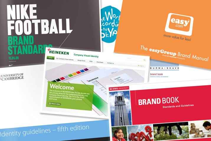
10 Brand Bibles for Inspiration
Look through some of these brand bibles – some current, some old – to help you get started building your own. It can be a tough project, but the end result is really worth it.
Conclusion
In the creation of your brand bible, think of how it will be used. This document is a reference material and guide for how the company should be portrayed to the public.
Include examples and specifics. Keep the guidelines direct and simple but also think about how restricting they can be. Guidelines that are too strict can limit creativity and new designs; guidelines that are too loose may result in multiple or disjointed brand identities.
Use your brand bible as starting point and establish a culture around it that allows designers room for creative thought while maintaining the aura of the brand in a variety of projects. Remember the ultimate goal of the book is to create a distinct and unified presence for your brand.