Having a killer design agency portfolio website is the best way to persuade your big design clients to hire you. Your portfolio website is the one place where you get to brag and show off all the work you’ve done. But, unfortunately, it’s also one of the sections that most design agencies get wrong.
If your portfolio takes a long time to load, uses outdated technologies, or doesn’t convey a clear message, you’re setting yourself up to fail. When it comes to designing a portfolio website, uploading a bunch of screenshots of your work or stating random facts about your agency will never work.
A great design agency portfolio website should not only showcase your best work, but also display your signature design style that will make it much harder for your clients to take their eyes away from your website. Today we’ve collected a range of amazing portfolio websites created by popular design agencies, for you to learn and take inspiration from them.

Stupid Studios

The design agency Stupid Studios has one of the boldest and strangest websites we’ve ever seen. And just like the company motto, their portfolio page is also “stupid” simple. The website also has another section called “playground” where the team showcases some of the stuff they’ve designed for fun.
Small Studio
The agency may be “small”, but their website portfolio certainly says a big story. You can actually browse the entire portfolio of Small Studio without having to load any extra pages.
Rally Interactive
Rally Interactive’s portfolio is highly interactive. You can click or touch and drag around the website to browse from one page to the next. And they are all full of wonderful animations.
Departement Creatif
When it comes to infinite scrolling websites, web designers feel a bit skeptical. But, the Departement Creatif does it so well that you might even consider following their footsteps for your own design.
Built By Buffalo

Built By Buffalo uses a stylish polygon shaped portfolio design to showcase a lot of their work without taking up too much space.
Cast Iron Design

Cast Iron Design’s website homepage serves as its portfolio featuring full-screen sized images. And with a single click over an image, you can expand more information in place.
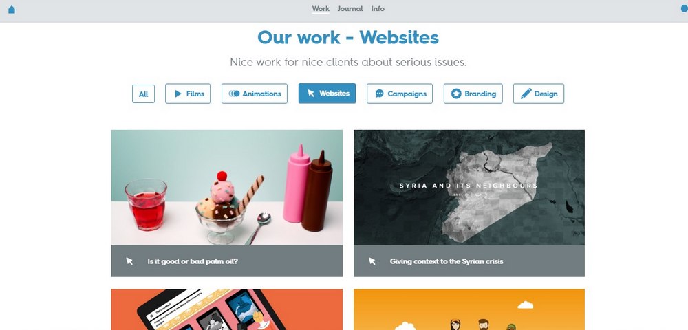
Nice And Serious

This is yet another great example of a minimalist portfolio website. The fun loading animations are a nice touch as well.
Spry

This design agency uses a card-based design for its portfolio page, which reveals more details about each project upon hovering over an image.
Lounge Lizard

Lounge Lizard is a radical web design agency with a full-screen grid-based portfolio page.
Alchemy Digital

This innovative portfolio is completely black and white and it only reveals the images once your hover your mouse cursor over a featured case study.
Icelab
With colorful dots floating all over the website, browsing the Icelab’s portfolio makes it feel like you’re swimming in the ocean.
SFCD
This app design agency portfolio has combined its portfolio and contact page into one page to help save both your time and mouse clicks.
Just Be Nice

Russian web design agency, Just Be Nice, will instantly grab your attention with its weird animated image on its homepage.
Fable&Co.

In addition to its beautiful typography, the portfolio of Fable&Co. Nicely showcase all of its work on a full-screen grid-based page with a zoom-in hover animation.
Cappen

Brazilian creative design agency, Cappen, showcases its work through a categorized page with smooth scrolling and a custom loading animation of their own.
OrangeYouGlad

The beautiful and colorful portfolio page of OrangeYouGlad is the perfect example on how to make websites that are fun to explore.
Hello Monday

The creative design agency, Hello Monday, has a fluid and responsive portfolio website with images that move around when you hover over them. It’s quite fun to play around.
Pointless Corp

A design agency portfolio doesn’t always have to be full of images and screenshots. Pointless Corp uses bright and colorful artworks to showcase its best work.
You may have figured it out by now that there’s no right way to design a portfolio website. It all depends on your brand creativity. So, put your imagination to work and see if you can design a unique portfolio for your agency that looks even better than the ones on this list!


