By now the term “hamburger menu” is something we are all familiar with. Love it or hate it, this little element has been one of the bigger trends in website navigation design this year.
But it is not the only big change that’s been happening when it comes to how we design navigation patterns and elements. From super small navigation – such as the hamburger – to oversized navigation options, providing users with a clear and easy path to information should be a top concern for designers.
1. Full-Screen Navigation

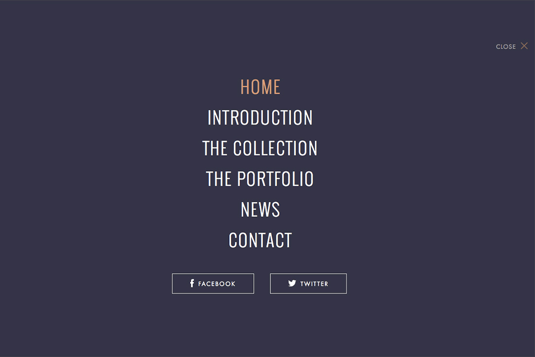
What happens when navigation is the design? When planned and integrated well, it can be an effective technique that helps users move through different pages and be engaged with site content.
This technique can be fairly obvious when it comes to the design or include a more subtle approach. Do users know the main content is actually navigation? If they don’t have to think about it – or how to use the site at all – chances are you have done it right.
2. Bottom of the Screen Navigation
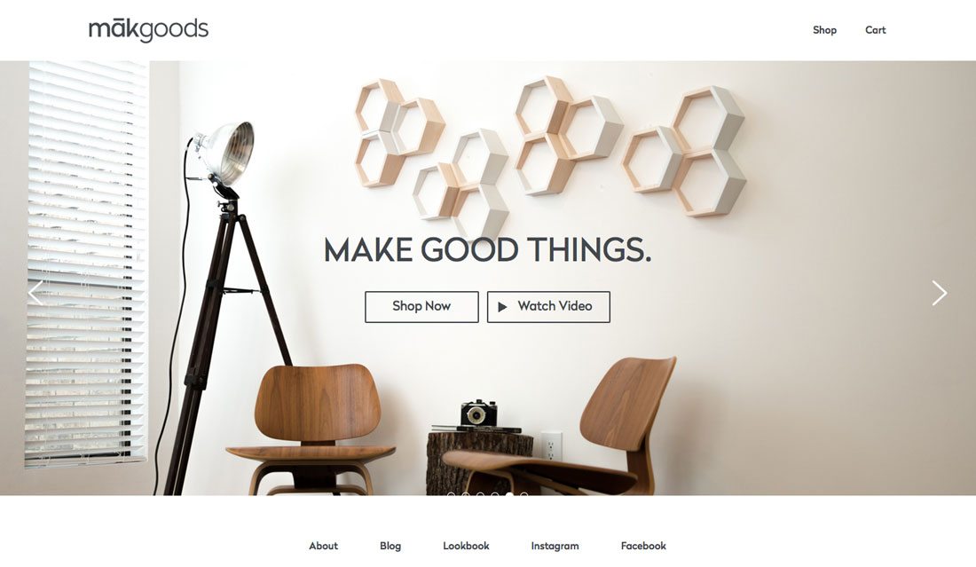
The most common location for navigation elements is the top of the screen. It’s been that way almost from the beginning of website design because it makes sense and works with the way people read.
But some designers are experimenting with moving the main navigation to the bottom of the home screen. It’s a fun twist that can work for navigation elements that are a little more oversized and particularly on one-page sites, where you don’t have to figure out alternative placements on other pages.
The key with this technique is to make it somewhat sticky so that users can find it easily if they do scroll or navigate away from the home screen. It also needs to be fairly obvious so that users don’t get left wondering what they are supposed to do next.
3. Vertical Stacks
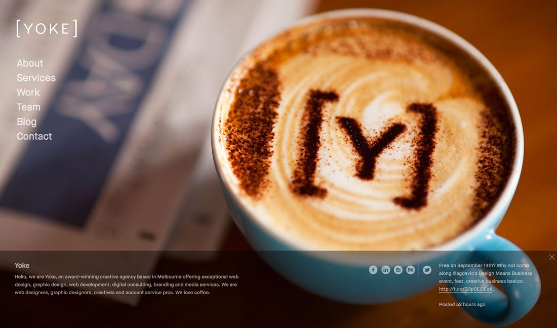
Another way to break from the “standard” style of navigation is to try a vertical option rather than horizontal line of menu items. Vertical navigation is fun and can present some new ways to think about the website canvas and space.
The two most popular styles of vertical navigation include the use of a hamburger icon that opens a vertical navigation bar on click or an almost two-column style layout with navigation filling one of the column “containers.”
What can be fun about the second concept is that it gives you a different kind of shape to work with for the main part of the website design. (And on smaller screens, the vertical navigation can easily be hidden to give the content more room and maintain the same look.)
4. No Navigation
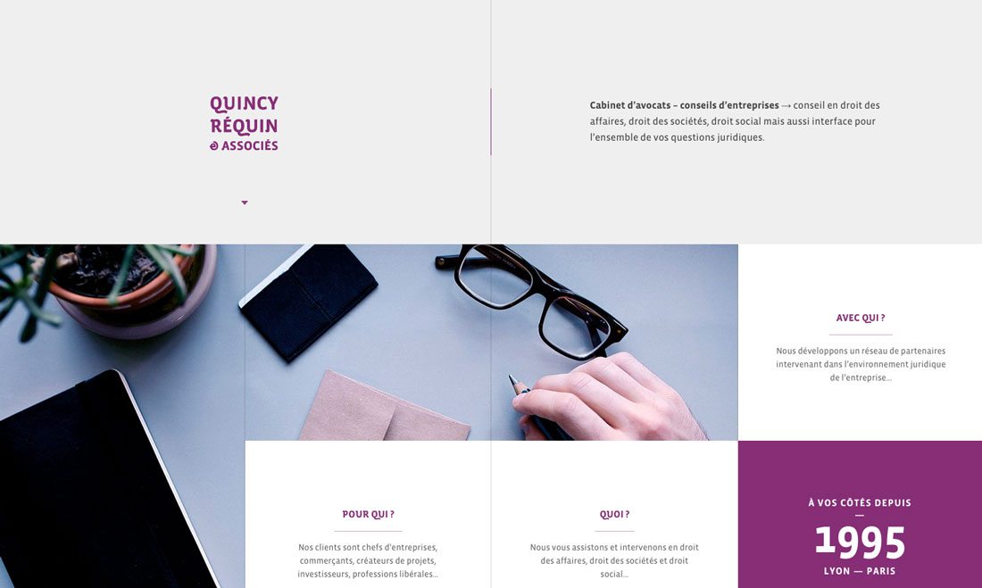
Some smaller sites are using a framework that does not actually contain any navigation at all. The main caveat here is that this pretty much only works on one-page sites. But it can work and is a good option if you are launching a coming soon, preview or introductory page (and you can add navigation as the page is built further out).
This is not a technique that is recommended if your site contains multiple pages of content, although some agency sites are finding success with this concept. What if you navigation answers questions from users? That’s exactly what the Quincy Requin & Associes legal site does. With no traditional navigation each link takes you to a page that answers a specific question.
5. Slide-Out Menus
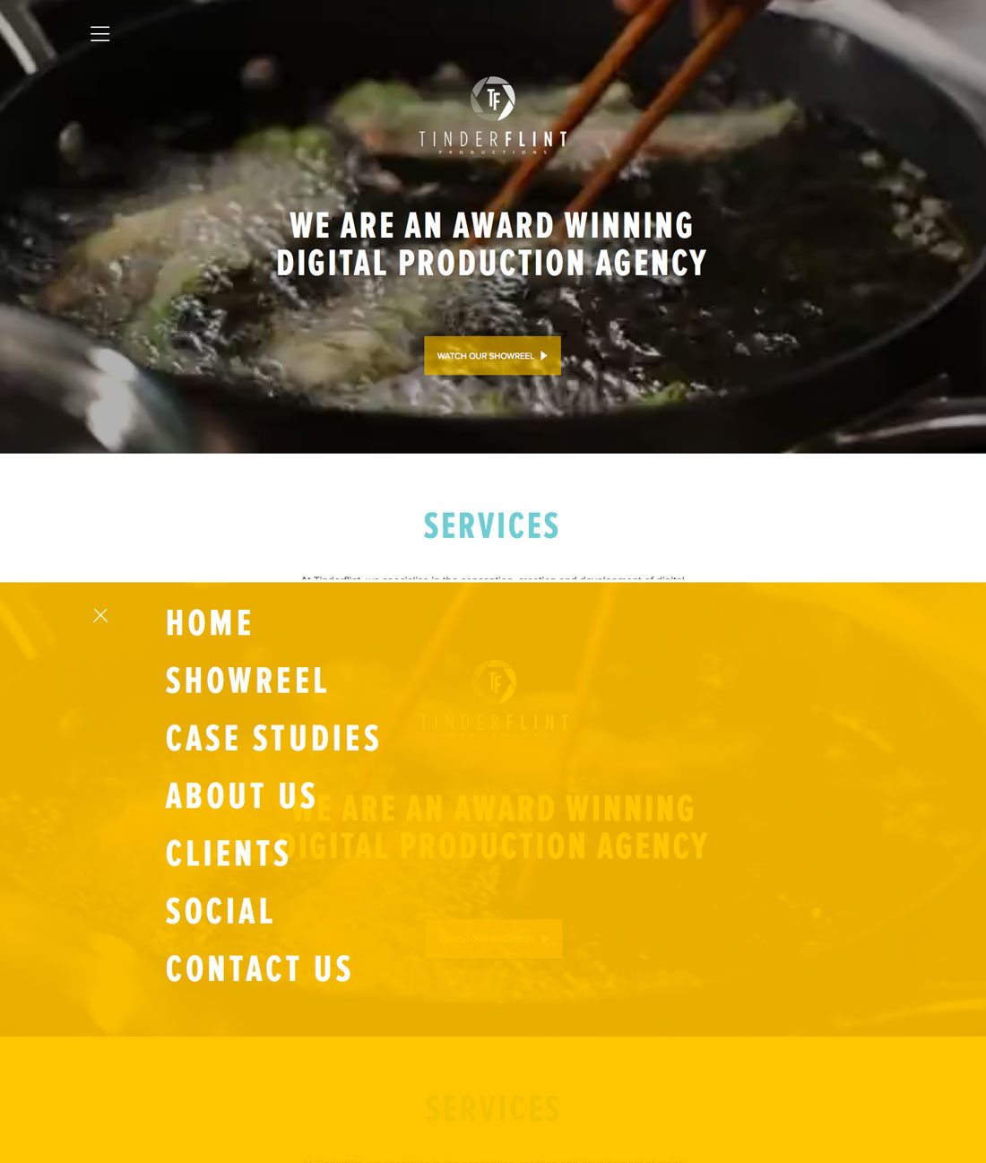
Slide-out navigation has been popular for mobile for some time. It provides a nice alternative so that main content can be displayed first on a mobile device rather than giving users a look at only the navigation as a first mobile impression.
That same concept can work for the full design as well, with slide- or swing-out navigation options that work responsively and on all devices. This type of technique provides a fun surprise for desktop users as well, because they probably won’t expect this “mobile style” treatment.
6. More Mega Menus
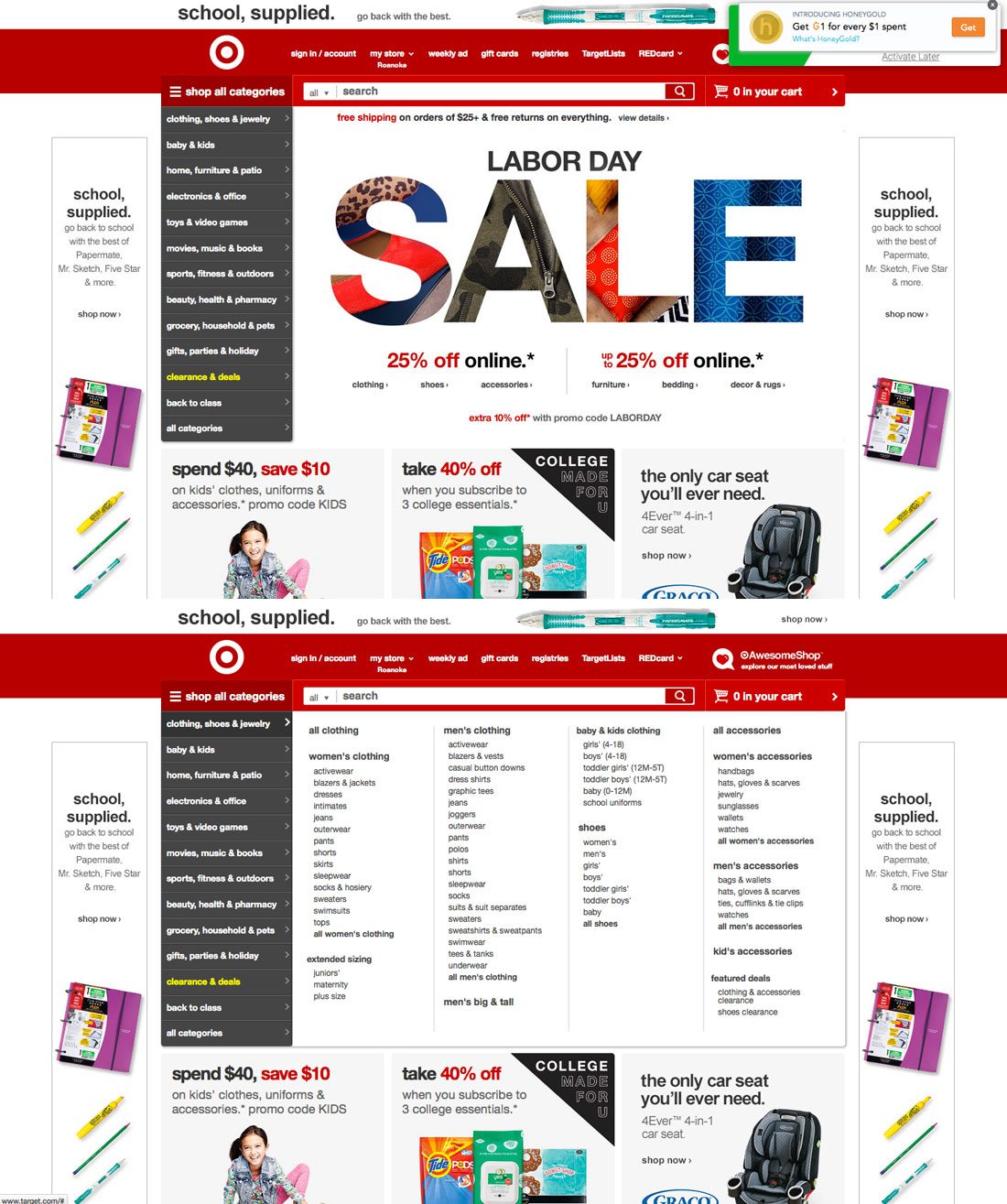
While the some of the mega navigation menu designs that were popular a few years back were short-lived (mostly because they did not work well in non-desktop environments), designers are rethinking the mega menu concept. It’s still being used most often on desktops, with secondary options for smaller screens, but with a little more success.
Large retailers with vast user choices tend to especially like this design concept. Target, for example, has almost perfected mega navigation. The site actually contains two layers of navigation – across the top for users who want something quick and basic and side, mega navigation for users looking to browse by department. What makes this style of mega navigation work is that it fills the screen. There is no doubt as to what you are getting with a department link click. From there, users can look for items by category. (And every pop out element is the same size, keeping the design nice and clean.)
7. Animated Navigation Elements
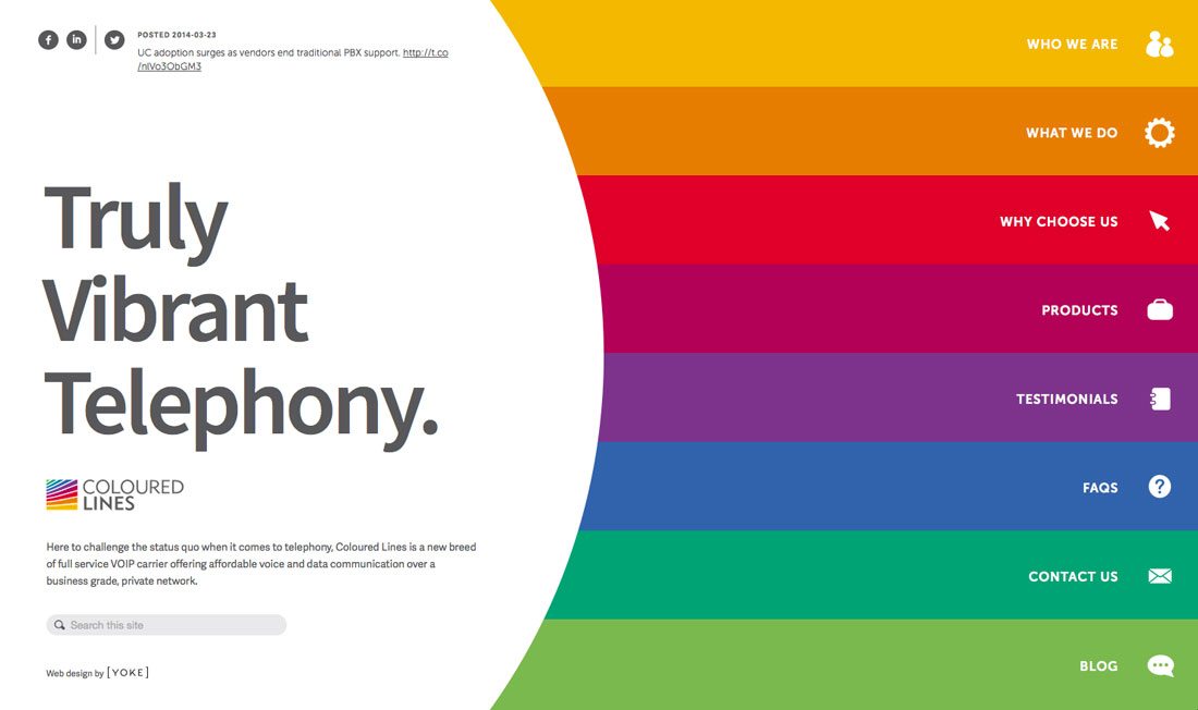
Animation is the it trend of 2015, so it only makes sense that it is becoming increasingly popular for navigation styles as well. The best animation when it comes to navigation is simple.
Stick to a nifty hover action or try a bouncing arrow to help lead users through the design. Colored Lines uses this simple concept so that each clickable area expand slightly when the mouse moves over it. The animation serves a great purpose by helping the user know where they are on the screen and which link will be clicked.
The small movement is a nice visual as well. It provides an element of surprise that can encourage users to stop and further investigate how the site works and see what other little goodies might be in store.
8. Card-Style Navigation Options
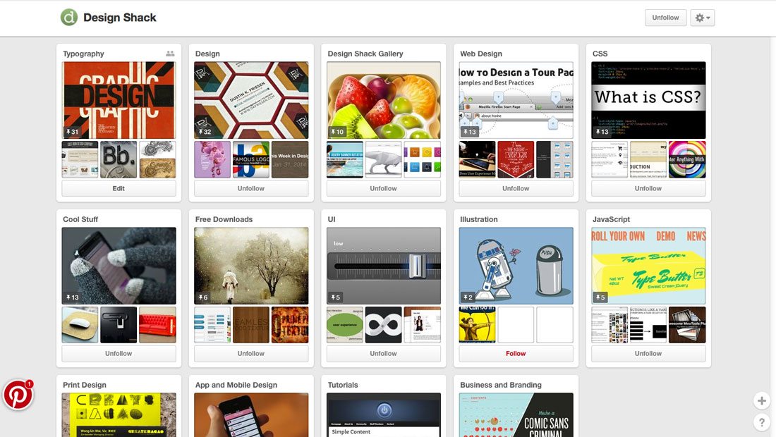
Pinterest uses cards for everything, including navigation, to help users move through the site. It’s one of the most effective outlines employing card-style design out there. Users of all ages seem to figure it out with ease.
Each different board is a card. Each board contains more cards and there is a perpetual deck of cards and links to follow around the site. It’s designed to keep you clicking all day long.
And more users and sites are getting comfortable with this format. There are even guidelines for card-style design in the popular Google Material Design documentation. This style of navigation works best if you have a lot of content that can stand alone without necessarily having ties to other bits of content throughout the site. https://www.google.com/design/spec/components/cards.html
9. Button-Free Navigation
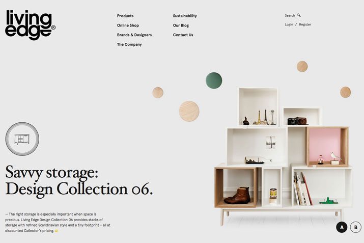
Text as buttons is the new button style. A single line of nicely-spaced text across the top, bottom or down the side of a page is a simple and easy to use navigation style. You don’t have to worry about button styles or elements that can get in the way of other parts of the design. (This works especially well with full-screen images, for example.)
The way to make it work is to use a simple – and highly readable – typeface that stands in stark contrast to the background. (You really need a light and dark pairing for maximum impact.) Include plenty of space between words so that each has plenty of room to be read and clicked and make sure there is ample space around each text “button” to be selected with ease using a mouse or finger tap.
10. Single-Page Scroll Navigation
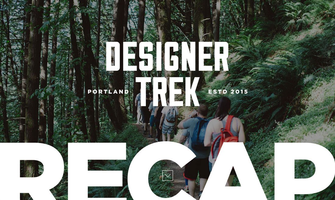
When it comes to single-page websites, the navigation is often in your fingertips. Without other obvious cues elsewhere in the design, users will scroll (or swipe) to find what’s next.
This can be a tricky technique and works best with a site that does not contain a lot of content. But for a simple framework where there is a singular action users are expected to complete, it can work. The lack of traditional navigation elements can pique the interest of users and actually encourage them to dig a little deeper into the website. So make sure there is something interesting there for them to find!
Bonus: 5 Sites with Unique Navigation
You’ll have to click through these sites to really appreciate the different approaches to navigation, but each of these five websites tries something a little different when it comes to finding information on their sites.
Adwyse
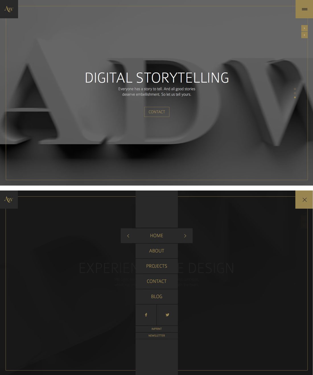
While this site appears to follow the standard hamburger icon look, expanding the icon is much more. The expected simple navigation turns into a full screen option.
Cave a Bieres
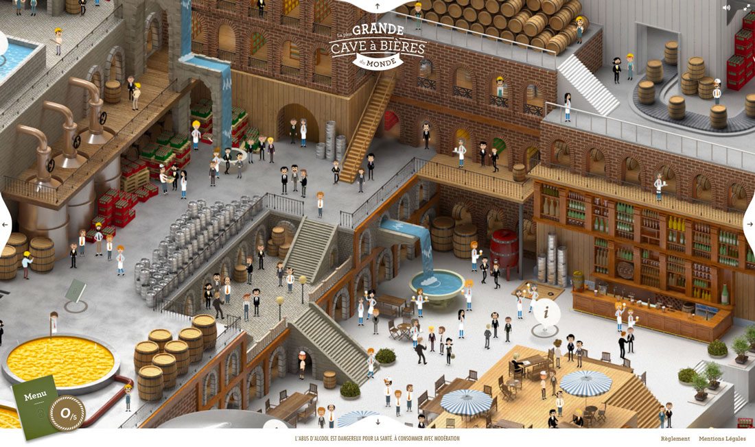
Can you find the navigational elements? They are actually hidden within the visual story in this website outline.
Seeing Data
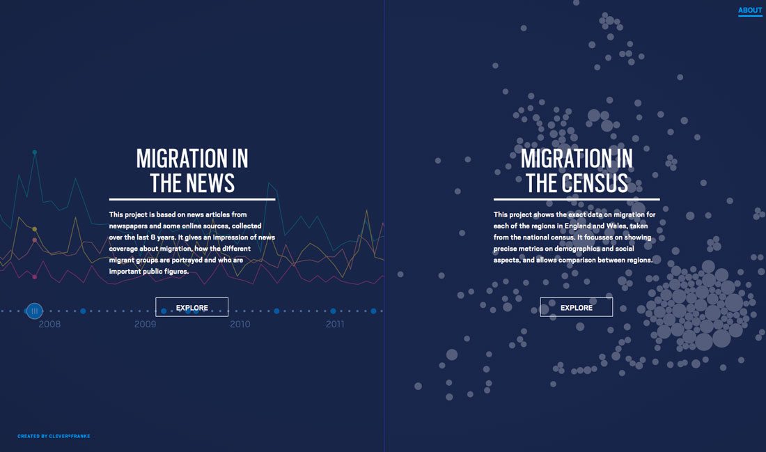
This site is a complete maze of story-like information. Each click takes you through a different data set, with different choices – none of which look like (but actually are) navigational tools.
Ludlow Kingsley
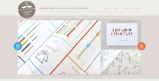
The navigation is “hidden” in the start bar and triangles at the bottom of the screen. It’s a non-traditional approach that encourages clicks and scrolls, but would you find it interesting and practical all the time?
Nike LiDyana

Another site that uses navigation as a storytelling tool, where the user makes choices to navigate between pages. Unlike most sites, it takes a while to see where you are going, but the journey is interesting and fun the first time around.
Conclusion
So where do you fall when it comes to website navigation – more traditional or more cutting edge? As with any other trend, figure out why you are trying a technique before attempting it. Does it best suit the project you are creating?
Think of your users as well. Design navigational elements and navigation flow that will create the most simple and direct route to where users are supposed to end up. If the flow is confusing, you might lose valuable clicks or the action from them, such as sales. Make it easy for users to know where to go and what they are supposed to do on your website.

