Taking the pain out of doing your taxes
TaxAct® is an affordable tax preparation solution for individuals, business owners, and tax pros. Designed by experienced accountants, TaxAct digitizes IRS and State-approved forms. Then, built-in logic searches tax codes and implements best-in-class tax accounting principles to ensure accurate, optimized returns for end-users.
The Ask
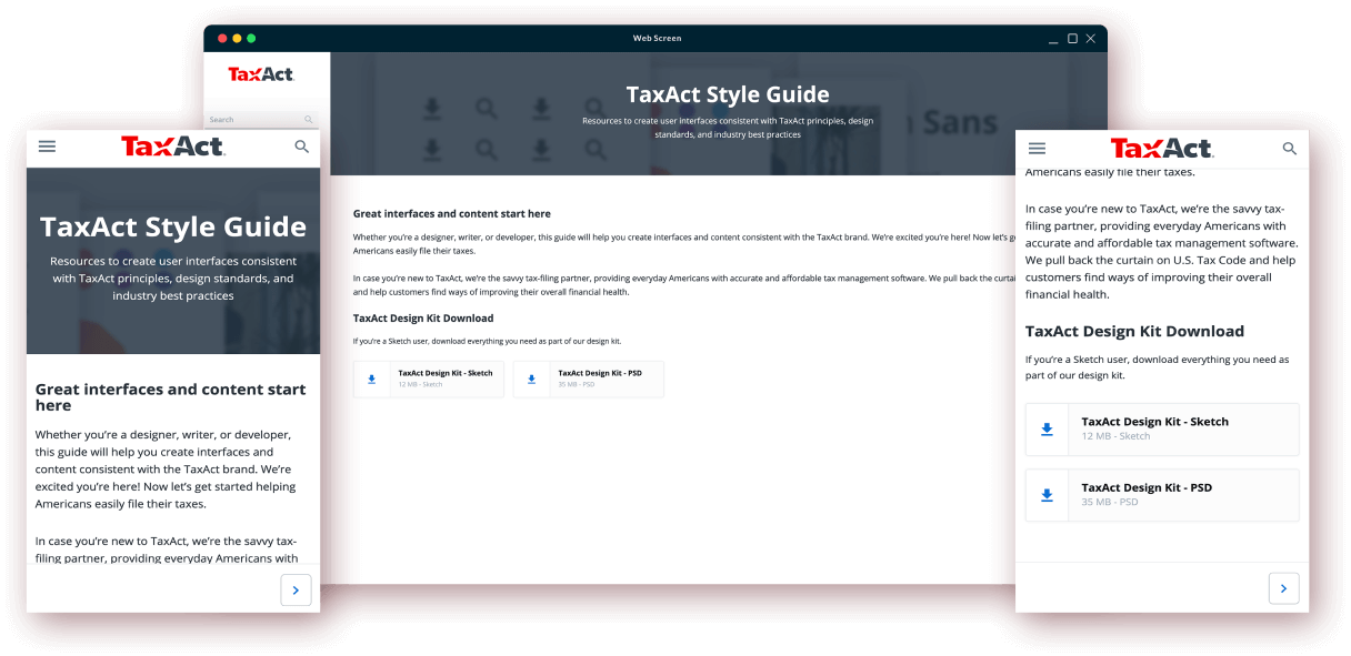
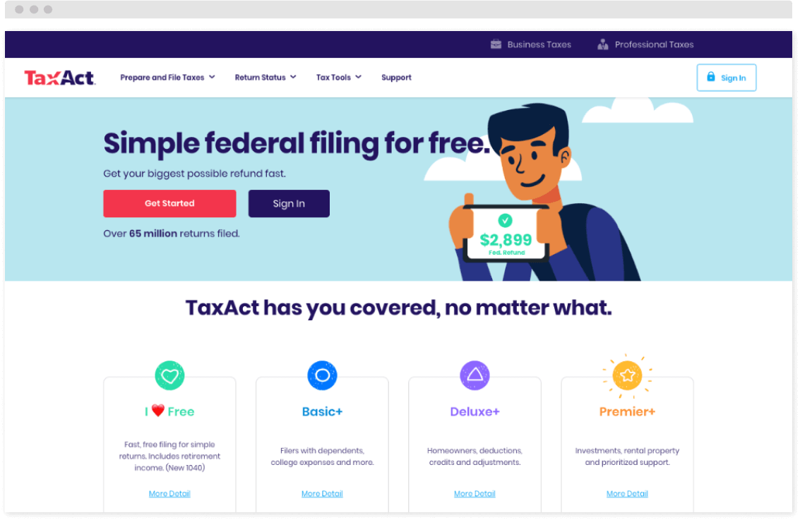
Seeking to improve its web application and mobile experience, TaxAct partnered with Mayven to re-think the application UX/UI. The goal? Improve the user experience to increase user acquisition and decrease customer support requests.
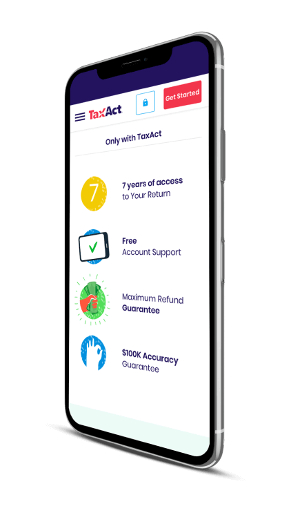
Mayven was changed with redesigning the flow of TaxAct’s mobile login and sign-up. TaxAct wanted to achieve stronger mobile metrics once a user started their tax returns. The ultimate objective was to enhance both the online experience and mobile app to drive the completion of more taxes by more registered users.




The Build
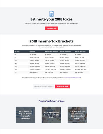
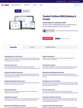
Mayven’s approach was bottom-up, starting with the fundamentals of User Experience (UX) research. Before building low resolution journeys (wireframes), Mayven developed user personas and collected end-user input. Then, using Sketch and Photoshop, Mayven created variations of an entirely new flow for login and account creation.
Once tested with end-users and approved by TaxAct, high resolution flows moved into rapid prototyping. Even the best practices in UX lend themselves to a mix of art and science. Mayven’s systematic approach to UX involves additional testing across a subset of end-users, studying how subtle variations in design improved performance.
Mayven’s last leg of testing and tweaking removes as much subjectivity as possible, yielding enhancements that go above and beyond re-skinning an app with a more attractive interface.

The Win
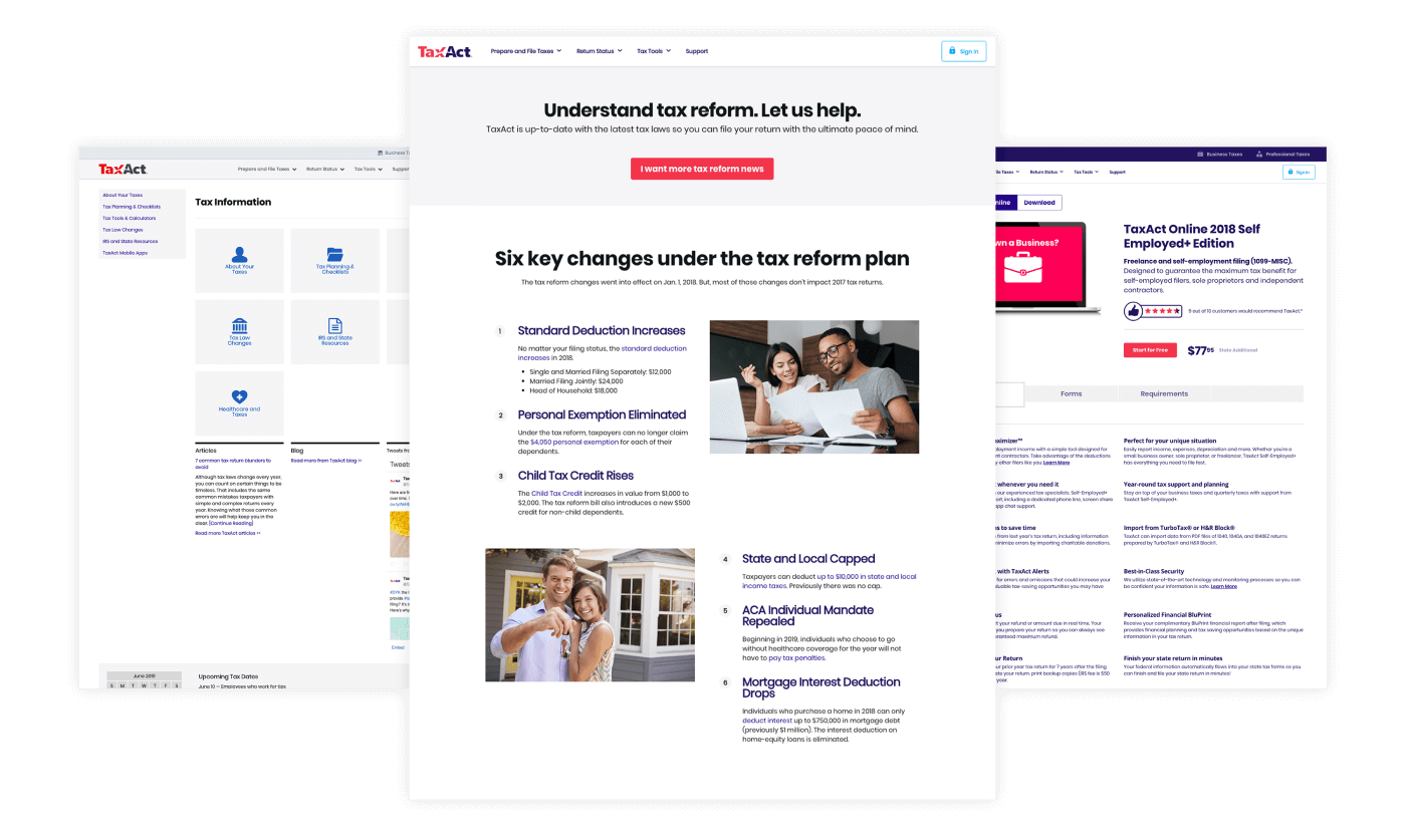
The final design received highly positive user reviews and higher metrics in user acceptance testing. Finishing touches were completed and Mayven’s new flows debuted in TaxAct’s applications for the 2017 tax year.
TaxAct soon reported higher user acquisition and lower requests for customer support. The re-design of TaxAct’s app succeeded in raising the bar—especially in the critical first steps of the user experience.
Get in touch to work together
Contact us